Saturday, 11 October 2014

Own film treatment

Directed by Cory Nelson, Connor Moreton, Ryan Eastman and Rachel Herring

Synopsis

A group of friends take a trip and decide to go camping in the woods but then strange events occur and the characters find themselves being picked off one by one by an unknown killer. The group then have to stay calm and survive the terror they face while also trying to understand the events that are taking place.  We have many digetic noises to alert the characters and create the suspense for the audience. All the directors (Cory Nelson, Connor Moreton, Ryan Eastman and Rachel Herring) are also starring in this incredible horror film which is certain to get the audience gripping their seats with its terrifying scenes and tension filled suspense.

Codes and Conventions

The codes and conventions of our film include jump-scares, tension filled scenes and fast paced. The trailer involves many frightening scenes which will create many enigmas and keep the audience gripping onto their seats. It also involves the typical conventions of a horror film with the main characters in peril are going to be the weak, vulnerable girls, conforming to the stereotype that women are seen as weak and powerless. Another convention of our film is that we are going to have the characters running from the unknown in order to survive, but the trailer will end with every character being shown to be in danger-this will keep the audience hooked as they will not know who lives or dies until they see the full film. Lastly our trailer will end with a girl running, with no digetic or non digetic sound, through the woods, terrified and alone and then a scream will be heard and the titles will appear.

Practised Film Titles

In this post I will examine different types of film titles and analyse each one to see if they suit our film.


This font is the "Face your fears font" and it is quite simple but is my favourite at the moment as it does have a sinister look to it and it looks like the killer has written this with the victims blood. I used a red font to connote danger and give the audience an indication to what the film will include.


This font is the "You Murderer" font and is similar to the first font and offers the same sinister look. The font looks as if it is the victims blood smeared onto a wall and the choice of red again connotes danger. This is a great font that offers a "slasher" theme to our film but I think that the first font looks more realistic.


This font is called the "Lumos" font and it is different to the others as it's not red and it's very plain. This font is plain and simple which follows the codes and conventions of a horror films as it is similar to other horror film titles, such as "Texas Chainsaw". The font stands out and is very sharp which gives the audience the indication that the film will be sharp and straight to the point. 


This font is from the horror movie "Scream". It has all the letter aligned apart from the sharp "W" as it stretches down lower than the other letters. This font may make the audience associate our film with "Scream" which is good because "Scream" was a successful horror movie, however we would like our film to have it's own style of font instead of just copying one that has already been used. 


This font is from the horror movie "Friday the 13th" which was another very successful horror movie. The font is not too bad but is a bit simple and plain for our movie. 

Overall I believe the top two,"Face your fears" and the"You Murderer", fonts are the best fonts for our horror movie as they offer a sinister theme and look like the victims blood smeared across a wall, which is perfect for our horror film. They also do not look very sketchy and could be seen in a big blockbuster movie. 

Own Film Brainstorm


Audience Research And Profiling


Generally, horror films target audiences aged between 16-24 and are more than likely predominantly favoured by men as they can be more immersed by each character than women do as they will react in a different way, which is by being scared, which could link with the female characters that are generally in peril like in most horror films.  The audience is usually males aged between 16-24 because men can interact with the characters whereas the women do not usually enjoy gore as it makes them feel "squeamish". This conforms to the stereotype that men are stronger than women. 

Our film's genre is horror and it is based in a woodland area-meaning that our film will follow other films with the same characteristics, such as are "Cabin in the Woods","Nightmare on Elm Street" and "The Hills Have Eyes 2", as they are all horrors set in one particular location instead of various locations like "Saw". This allows the audience to get a more in depth concept of what the characters are really feeling. 

Most people interested in watching these films would be couples and people that can enjoy and understand the sinister characteristics-which is why the target audience are aged between 16-24.

Font Research - Horror

As you can see, the font used for this horror film is simple and there is nothing which hugely suggests that it is the usual font used for horror films. The title is in block capitals and plain white. The white font is effective because of the black background. This makes it stand out more. On some of the letters in the titles, they have grey colours in them. As the huge chainsaw is directly above the title, and the chainsaw is the same grey that is in the letters, it could possibly provide a link meaning that when the see the chainsaw and the title the audience would automatically realise that the film is based on that chainsaw.


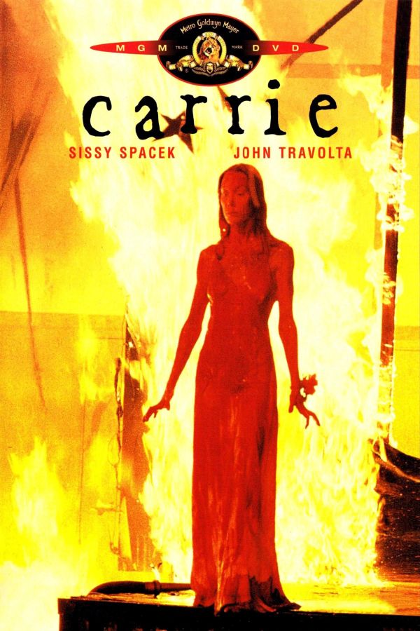
The font used in this film titles closely resembles hand writing. This is effective because it could show that a character from the film has written it which could emphasise the scariness of the film. Also there is no capital letters in the title so, again, it could suggest that it has been written by a character. The writing is black against a fiery red and yellow background. This is effective as it makes the title stand out. Also the colours used are red and yellow, both of which are colours that are related to horror films.


The font in this horror film title is quite plain, so there would be nothing to suggest that it is a definite horror film title if it wasn't for the images behind it. The writing is plain white against a black background which therefore makes the title stand out.


Overall there is a trend with the three fonts we have analysed. Firstly, all of the fonts seem to be relatively plain- there is nothing that suggests they are specifically horror film titles. Secondly, the titles are either white or black against either a bright background or a plain black background to make them stand out. This helps us into our font research because now we know that horror film titles are mainly relatively plain and they are usually black or white against the opposite colour background.

Location Research - Ashtead Common

We have chosen Ashtead Common to be the location for our horror film trailer. We decided to use this as the location because not many people tend to walk through these woods. This means that the trailer will have a scary atmosphere because the audience will know that the characters in the film are completely alone. Also, it goes with the typical convention of a horror film being located in woods. The effectiveness of conforming to the usual conventions of a horror film is that the audience will be able to easily establish that something sinister is going to happen. This would make them more interested in the trailer because they will be waiting for something to happen.

Also, the lighting in woods is usually fairly dim. This will also add to the scary atmosphere of the trailer because another convention of horror films are dark lighting. This means that the audience can understand that something deadly is most likely to happen. It also makes them more concerned for the characters because they can almost definitely conclude that these characters are in danger.

Wednesday, 8 October 2014

Horror Questionnaire


1) Do you enjoy watching horror films?

  • Yes
  • No


2) How often do you watch horror films?

  • Once a week
  • Once a month
  • Once a year
  • Never


3) What setting would you associate with a horror film?

  • Abandoned house
  • Woods
  • Hospital
  • Own home


4) Do you prefer a mix of gender in the film or only one gender involved?

  • Yes, I prefer a mix of males and Females
  • No, I prefer one gender
 
5) What props do you expect to see in a horror film?

  • A knife
  • A noose
  • A gun
  • Rags with blood and other.
  • A hammer
  • Blunt object

 
6) What do you want the ending to be?
  • Boy and Girl survive
  • Girl lives as boy sacrifices himself
  • Killer wins
  • Twist