 As you can see, the font used for this horror film is simple and there is nothing which hugely suggests that it is the usual font used for horror films. The title is in block capitals and plain white. The white font is effective because of the black background. This makes it stand out more. On some of the letters in the titles, they have grey colours in them. As the huge chainsaw is directly above the title, and the chainsaw is the same grey that is in the letters, it could possibly provide a link meaning that when the see the chainsaw and the title the audience would automatically realise that the film is based on that chainsaw.
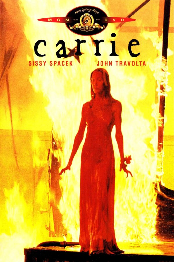
The font used in this film titles closely resembles hand writing. This is effective because it could show that a character from the film has written it which could emphasise the scariness of the film. Also there is no capital letters in the title so, again, it could suggest that it has been written by a character. The writing is black against a fiery red and yellow background. This is effective as it makes the title stand out. Also the colours used are red and yellow, both of which are colours that are related to horror films.

The font in this horror film title is quite plain, so there would be nothing to suggest that it is a definite horror film title if it wasn't for the images behind it. The writing is plain white against a black background which therefore makes the title stand out.
Overall there is a trend with the three fonts we have analysed. Firstly, all of the fonts seem to be relatively plain- there is nothing that suggests they are specifically horror film titles. Secondly, the titles are either white or black against either a bright background or a plain black background to make them stand out. This helps us into our font research because now we know that horror film titles are mainly relatively plain and they are usually black or white against the opposite colour background.
No comments:
Post a Comment